Design System
Design System
Component Library & Design Tokens for a Mobile App
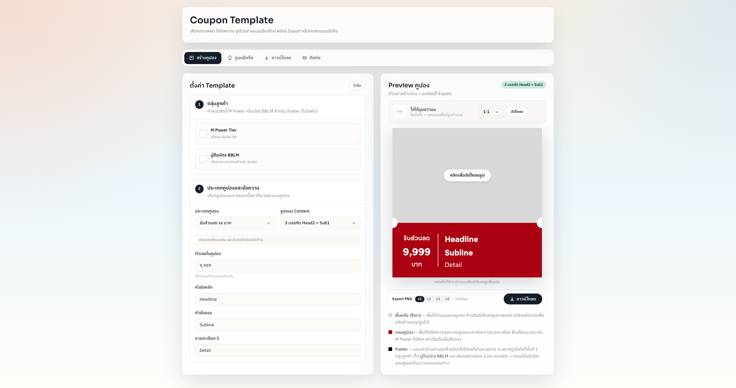
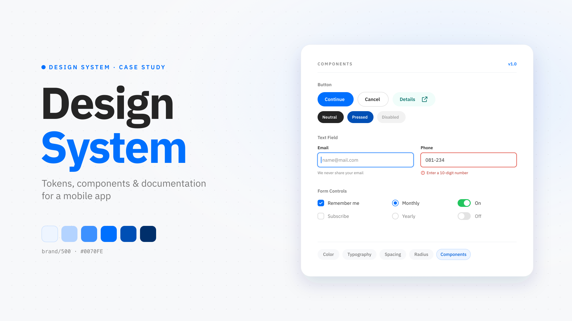
A selection of components, shown here for portfolio purposes only.
Built with
Tools behind the build
The core stack used to shape the product experience, interface, and implementation.

A design system that acts as the single source of truth for a mobile app's UI. Built in Figma with variables and component properties, it turns repeated UI patterns into reusable components — each documented with its variants, states, and usage rules — so designers assemble screens faster and developers implement them exactly as designed. Shown here is a selection of the core components.
The Problem
- Common patterns were redrawn screen by screen, drifting in size, color, and states each time.
- Developers had no reference for which states existed, so behaviour was guessed during implementation.
- Updating a single pattern meant hunting through every file by hand.
What I Built
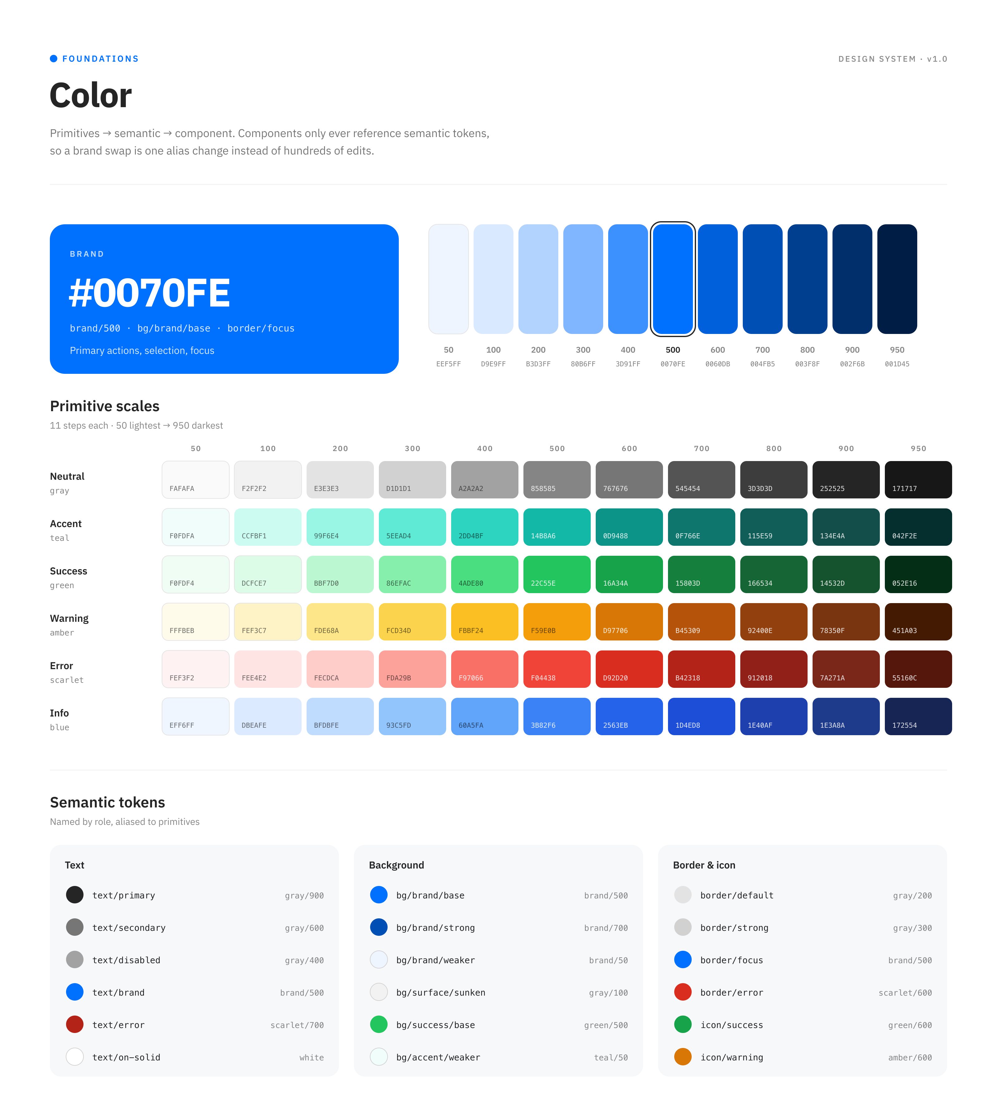
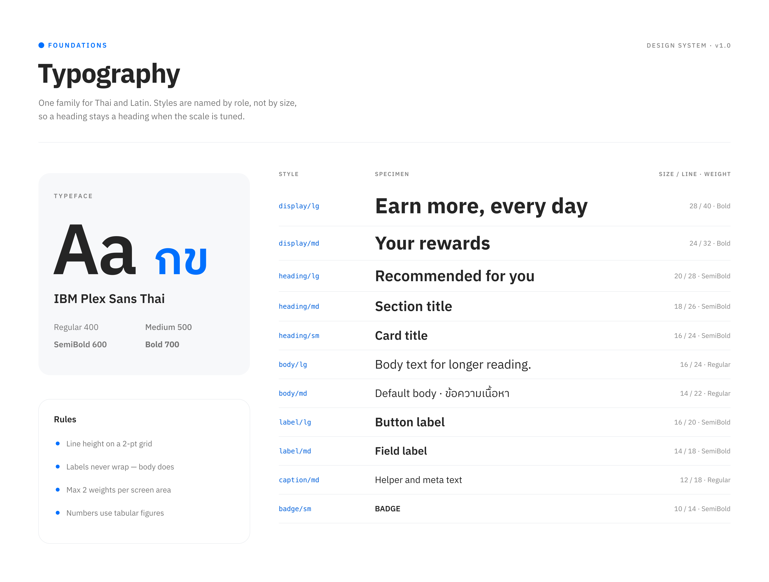
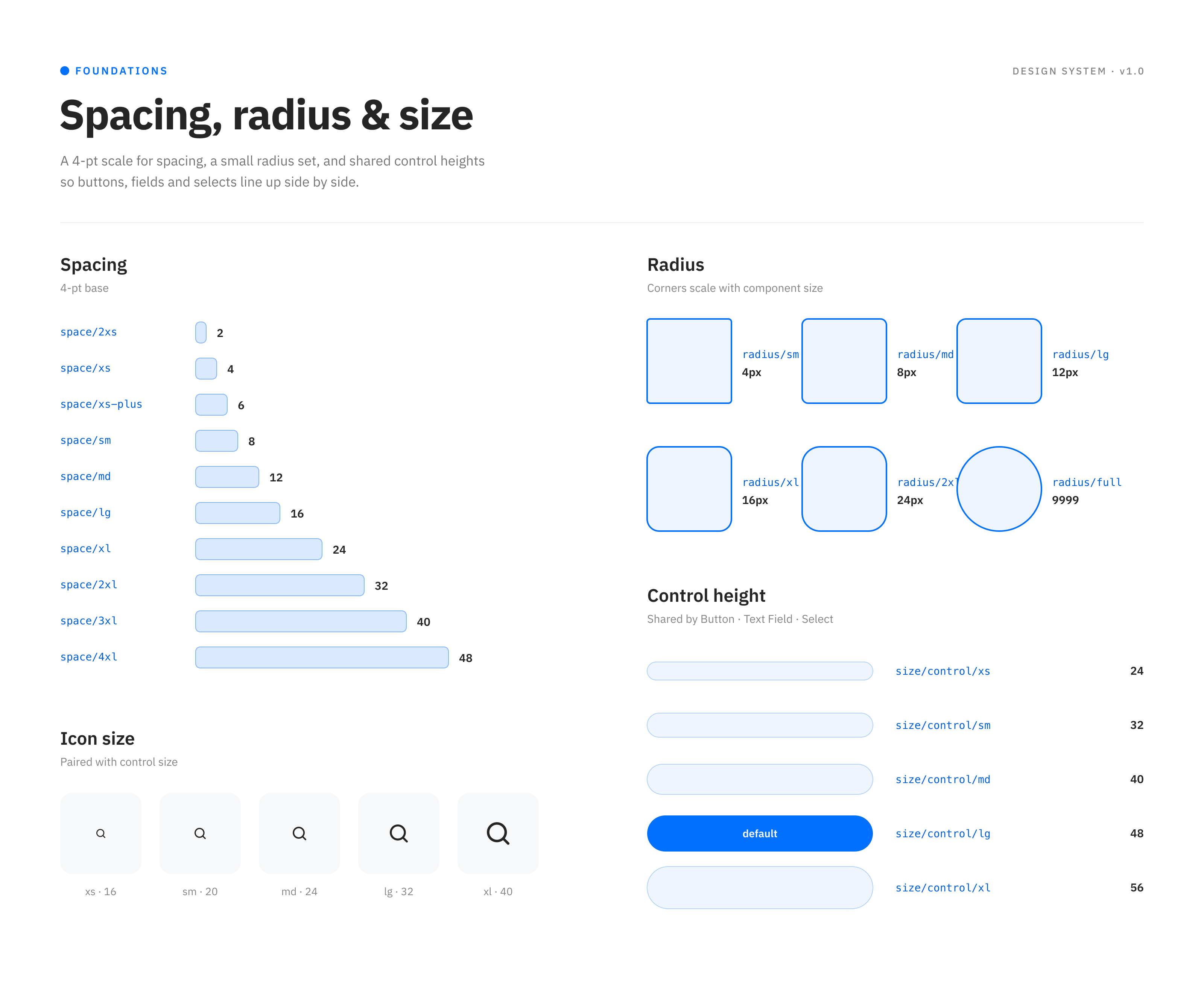
- Foundations — color, typography, spacing, radius, and control heights set up as Figma variables (design tokens) that every component binds to.
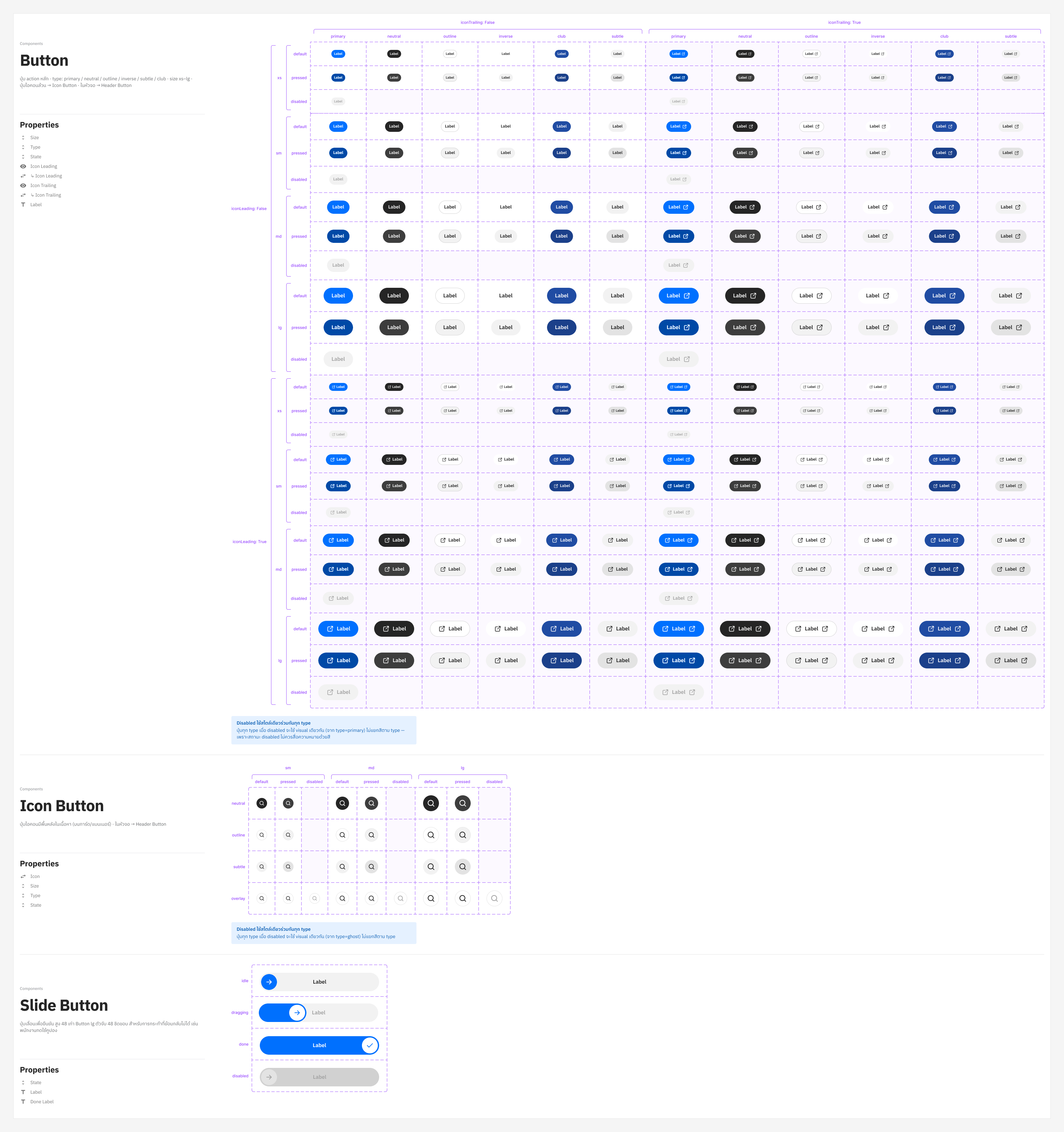
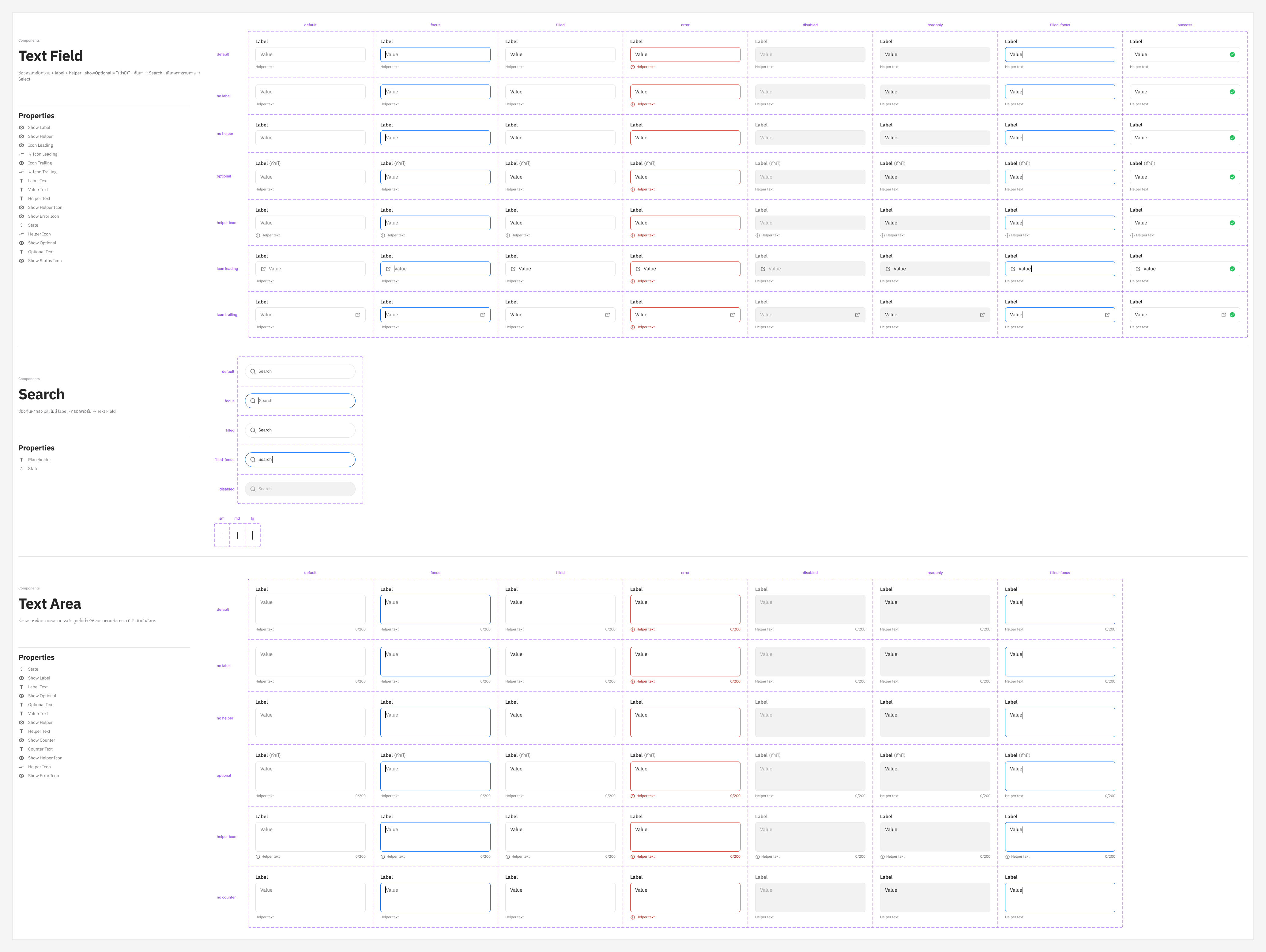
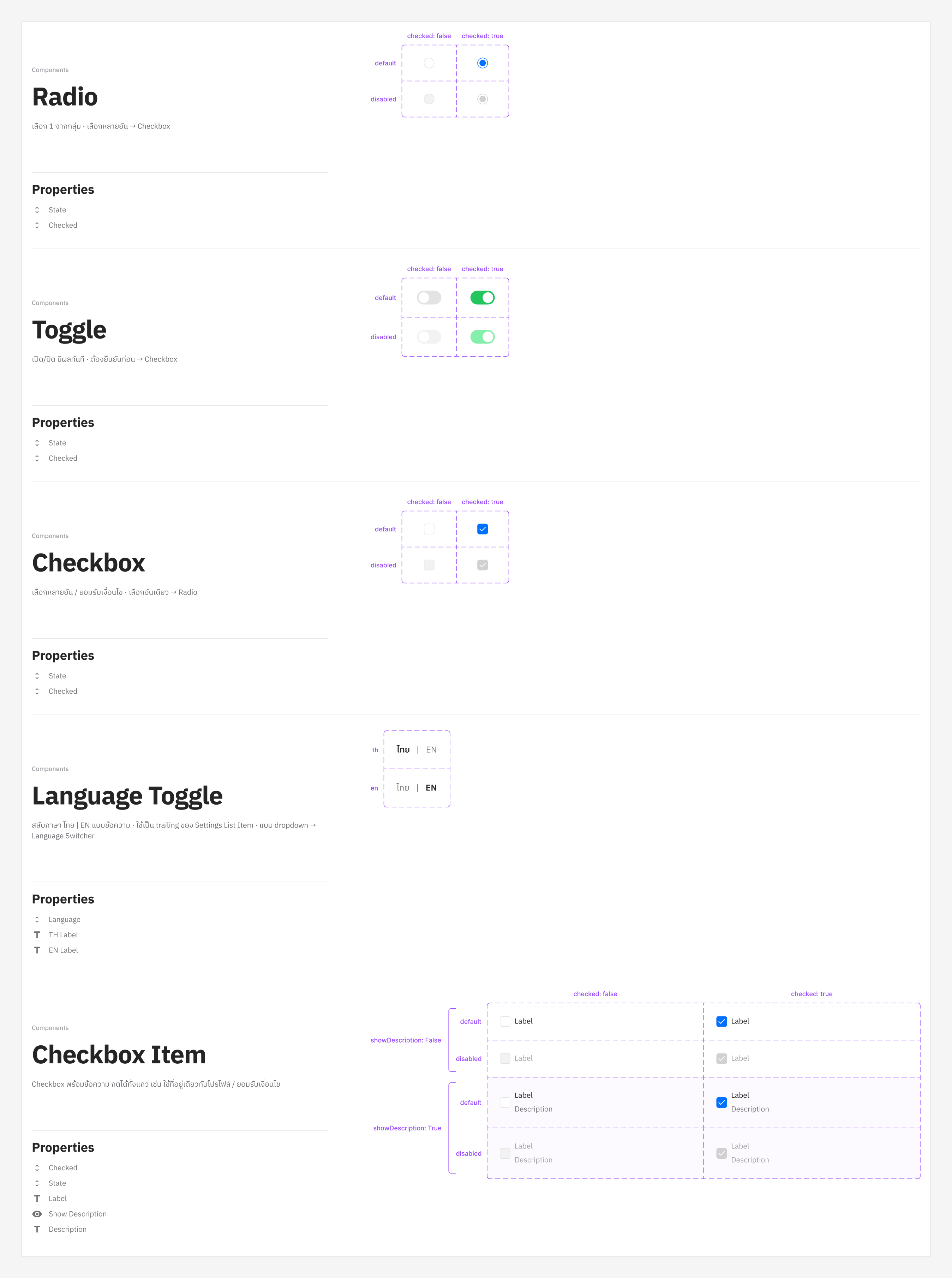
- Component properties — size, type, and state as variants; labels as text properties; icons as boolean + instance-swap properties, so one component covers every case.
- Variant matrices — every component laid out by its properties so all combinations are visible and reviewable at a glance.
- Doc pages per component — purpose, when to use an alternative, property list, and callouts for shared rules (e.g. one disabled style for every button type).
Tokens & Components
Foundations first, then a selection of the core components — each documented with its property list and full variant matrix.
Impact
- One place to change a pattern — updates propagate to every screen that uses the component.
- Faster handoff — developers read states and sizes straight from the docs instead of asking.
- Consistent UI across every screen of the app.